Water is blue. That's the assumption, anyway.
It's one I held for a while too, until I started actually looking at water rather than thinking about it.
What colour water is depends entirely on where it is. Water itself is almost colourless — what we actually see is the result of light, depth, and what's suspended in it. Different wavelengths of light are absorbed at different depths; reds fade out first, while blue travels further. In very deep, very clear water — off a tropical beach, in a Cornish cove on a bright day — that's exactly what you get: a cool, luminous blue-green that feels almost too vivid to be natural. The Maldives beach scene I made is vivid turquoise blue for exactly that reason.
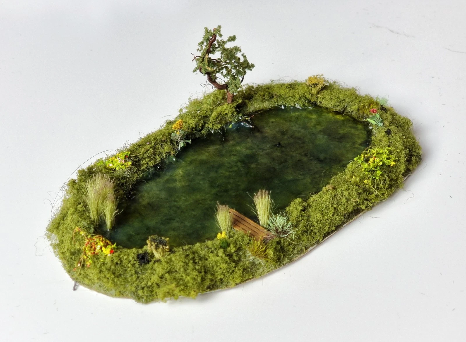
But stand at the edge of a canal, or a pond in Britain and it's very different. That water is shallow, slow-moving, and full of life. Green tones come from algae and vegetation growing in it. Brown tones come from silt and mud. It carries the slow drift of leaves, things growing just below the surface. Some of it is the colour of cold tea. Some of it, where roots overhang and the light barely reaches, is nearly black.
That's why the OO gauge ponds I make are green, edging towards brown. It sometimes surprises people, including my wife. They expect blue, but they're usually layered shades of green imparting depth — darker toward the centre, lighter at the edges — which, once you've looked at an actual pond, is the only thing that makes sense. That variation comes from what's painted beneath the clear surface, not in it. The water is almost an afterthought; the colour lives underneath.
Those shades matter in a way that goes beyond accuracy. There's something instinctively calming about water that reads as real — the soft layering of tone, the suggestion of depth, the way colour shifts from the edge inward. Get it right and you settle into a scene, feeling as though you're there, without knowing or realising why. Get it wrong and something nags, quietly, in a way that's hard to name.
No two pieces of water in my work are the same colour, each is mixed and adjusted individually, according to the scene or moment I'm aiming for. That's not a process that can be standardised. It's closer to the way a painter approaches a landscape: reading what's in front of them rather than applying a formula.
Ice follows the same logic. Ask anyone and they'll likely say ice is white or transparent. But thick ice carries blue in its crevices and cracks — that same depth effect at work, even in solid material. The surface is pale, frosted, almost white, while the deeper recesses hold colour. Both are true at once, and you can see the difference in my ice wargaming terrain pieces — the contrast between surface frost and the blue held in the cracks is what makes them feel thick rather than flat.
I keep a folder of photographs of unremarkable water. My local river on a sunlit afternoon. My garden pond in winter where the light dances on its surface. A lake in a nearby arboretum. Leats and coves in Cornwall. Whenever I'm passing a body of water, I'll pause and take a photo, because that kind of unhurried looking is where the real decisions get made — long before anything is built. Over the years, you stop seeing water as a colour and start seeing it as a set of particular conditions. The difference shows up in the finished piece.
When a water feature doesn't quite sit right, it's rarely anything to do with materials or technique. It's almost always that the colour has been decided rather than noticed. You feel it before you can name it.
The OO gauge pond and other water scenes are available to browse in the gallery.